
Introducción / Introduction
ES
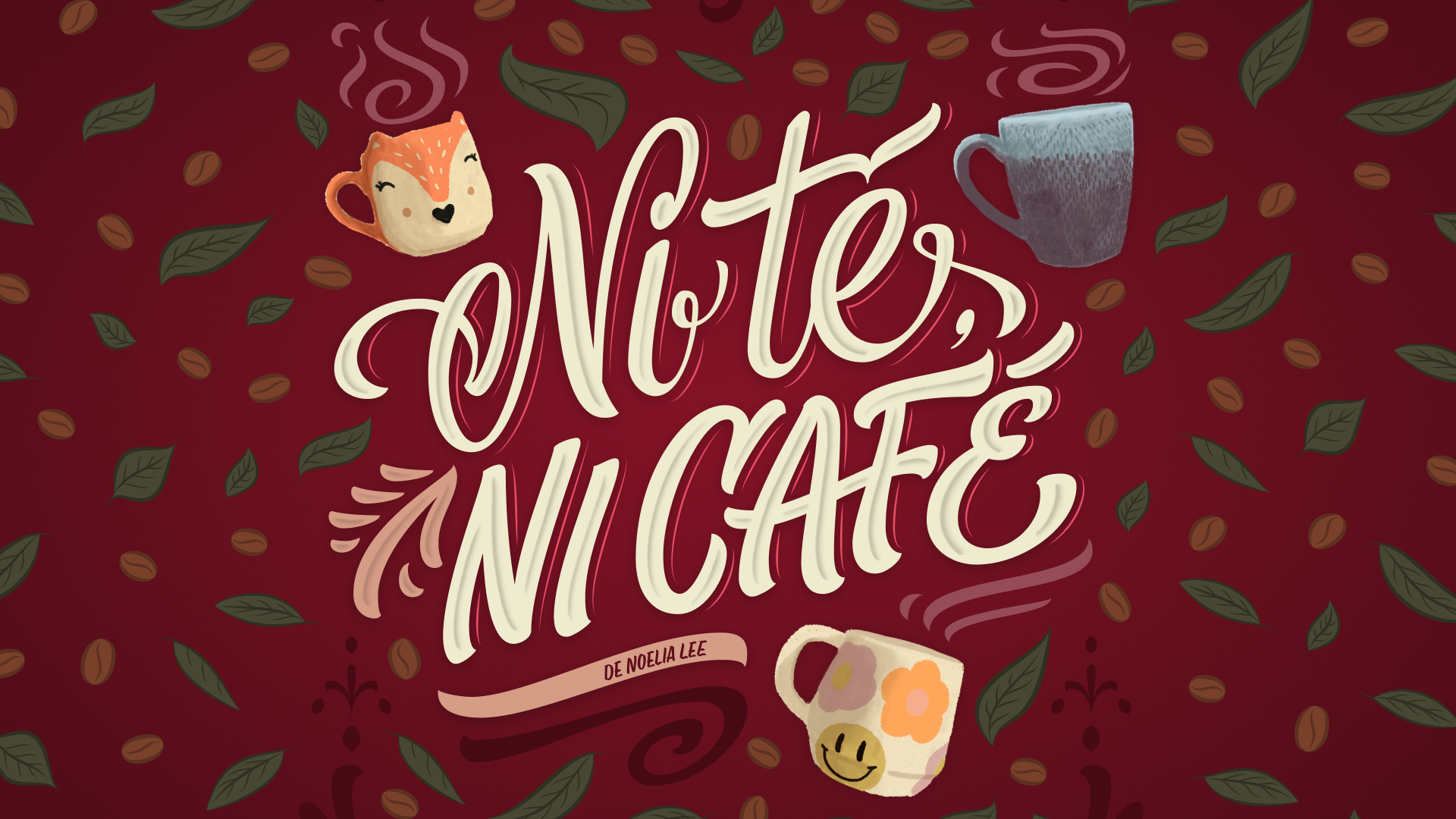
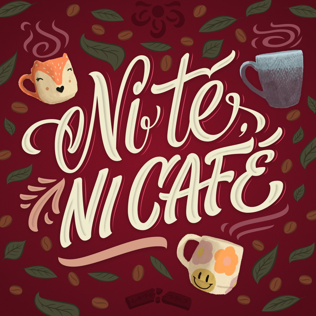
"Ni té, ni café" es una obra teatral escrita y dirigida por Noelia Lee, estrenada en 2025 en Ítaca Complejo Teatral, en el barrio de Almagro, Buenos Aires. La obra aborda el vínculo entre tres mujeres de distintas generaciones —abuela, madre e hija— a través de escenas cotidianas cargadas de intimidad, silencios y afectos.
"Ni té, ni café" es una obra teatral escrita y dirigida por Noelia Lee, estrenada en 2025 en Ítaca Complejo Teatral, en el barrio de Almagro, Buenos Aires. La obra aborda el vínculo entre tres mujeres de distintas generaciones —abuela, madre e hija— a través de escenas cotidianas cargadas de intimidad, silencios y afectos.
EN
"Ni té, ni café" is a theatre play written and directed by Noelia Lee, premiered in 2025 at Ítaca Complejo Teatral in the Almagro neighborhood of Buenos Aires. The play explores the relationship between three women from different generations —grandmother, mother, and daughter— through intimate, everyday scenes filled with unspoken tensions and emotional bonds.
"Ni té, ni café" is a theatre play written and directed by Noelia Lee, premiered in 2025 at Ítaca Complejo Teatral in the Almagro neighborhood of Buenos Aires. The play explores the relationship between three women from different generations —grandmother, mother, and daughter— through intimate, everyday scenes filled with unspoken tensions and emotional bonds.
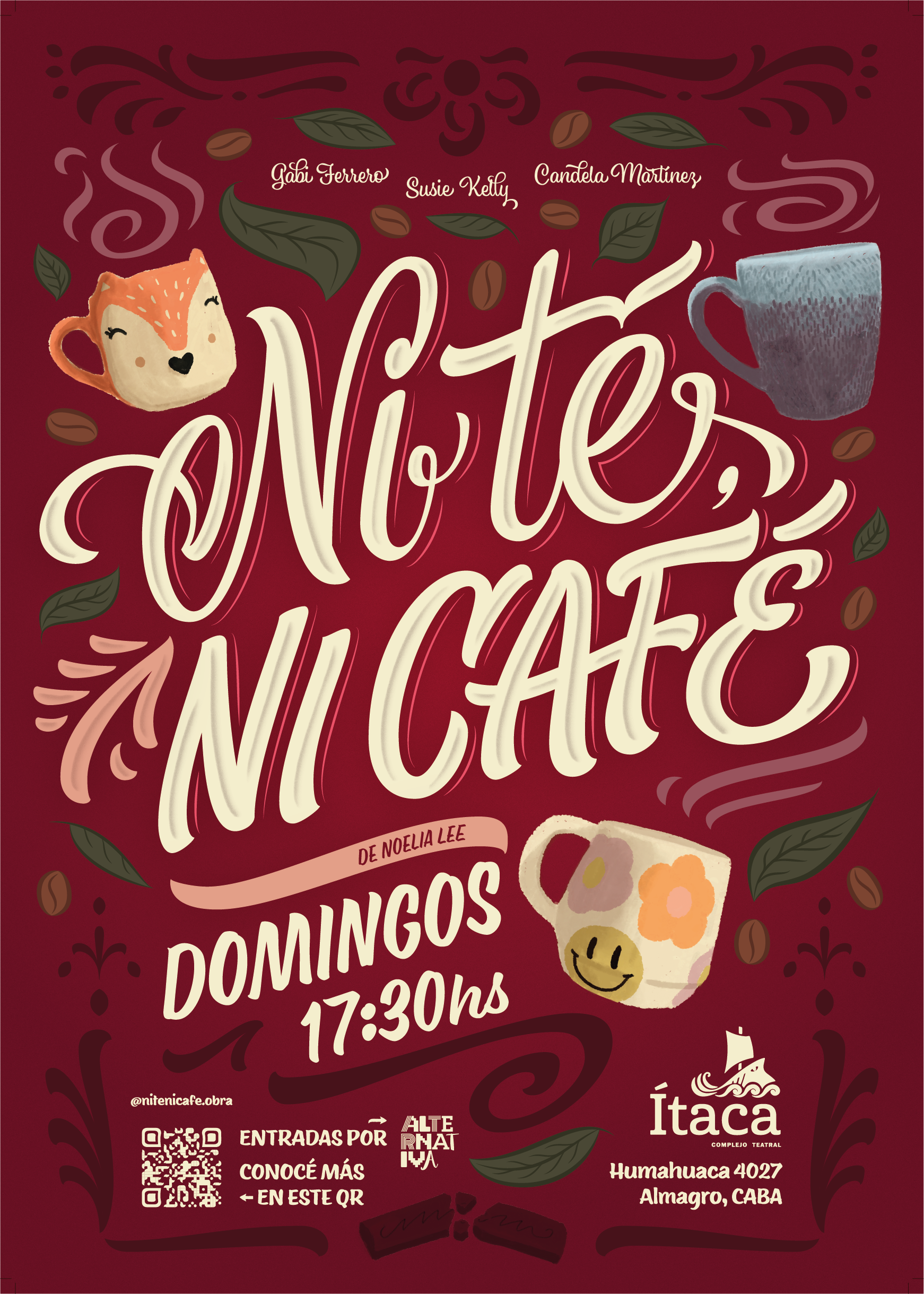
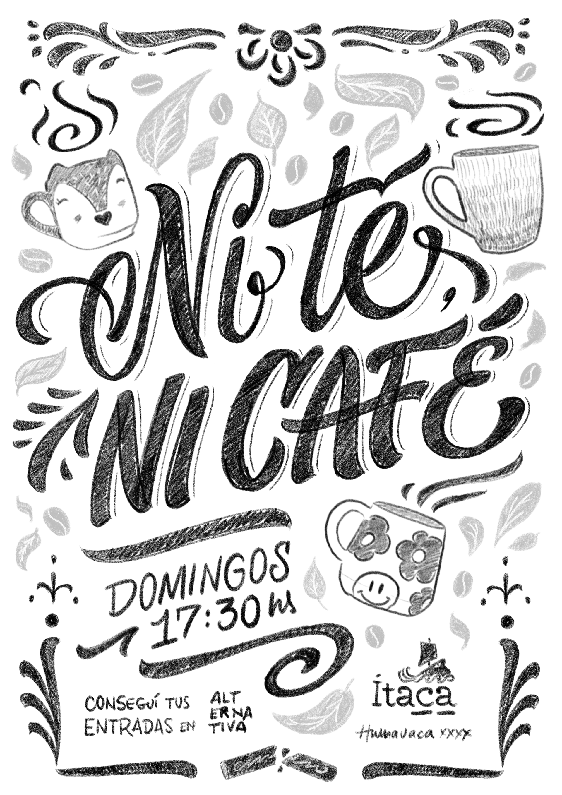
Afiche oficial para la cartelera del teatro / Official poster for the theatre billboard
El encargo y el desafío / The brief and the challenge
ES
Fui convocado directamente por la directora para desarrollar la identidad visual integral de la obra. Además de mi rol como diseñador y artista de lettering, participé también como asistente de dirección, lo que me permitió involucrarme profundamente en el proceso creativo y en la lectura del texto desde una mirada escénica.
Fui convocado directamente por la directora para desarrollar la identidad visual integral de la obra. Además de mi rol como diseñador y artista de lettering, participé también como asistente de dirección, lo que me permitió involucrarme profundamente en el proceso creativo y en la lectura del texto desde una mirada escénica.
El desafío fue crear una identidad visual desde cero que transmitiera la calidez y la intimidad de la historia, sin recurrir a fotografía ni a representaciones literales de los personajes. La gráfica debía generar curiosidad e invitar al espectador a acercarse a la obra sin revelar explícitamente su contenido narrativo.
EN
I was directly invited by the director to develop the complete visual identity of the play. In addition to my role as a designer and lettering artist, I also worked as assistant director, which allowed me to be deeply involved in the creative process and to approach the text from a scenic perspective.
I was directly invited by the director to develop the complete visual identity of the play. In addition to my role as a designer and lettering artist, I also worked as assistant director, which allowed me to be deeply involved in the creative process and to approach the text from a scenic perspective.
The challenge was to create a visual identity from scratch that conveyed warmth and intimacy without relying on photography or literal character representation. The graphic language needed to spark curiosity and invite the audience in, without explicitly revealing the story.
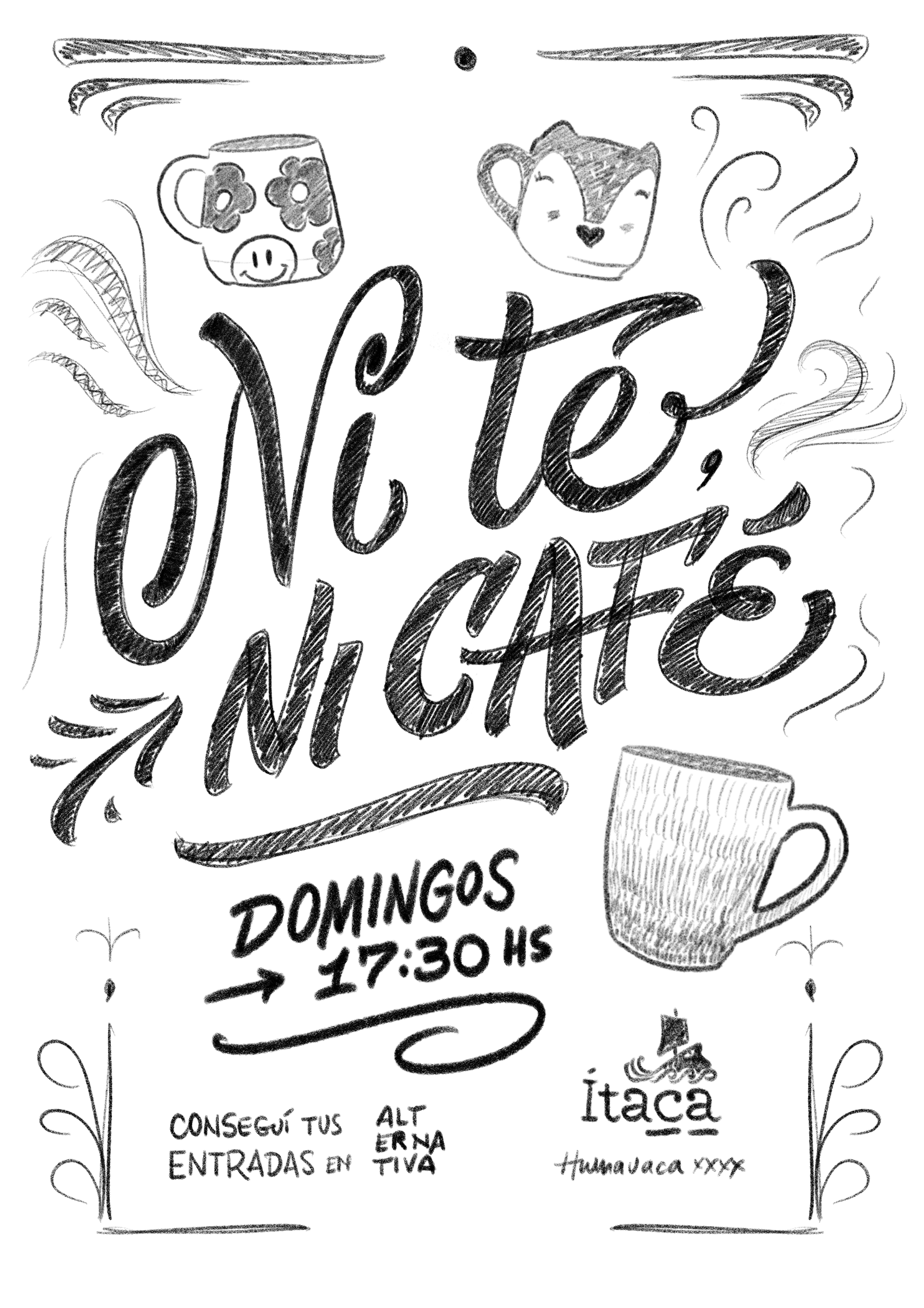
Primer boceto / First rough sketch
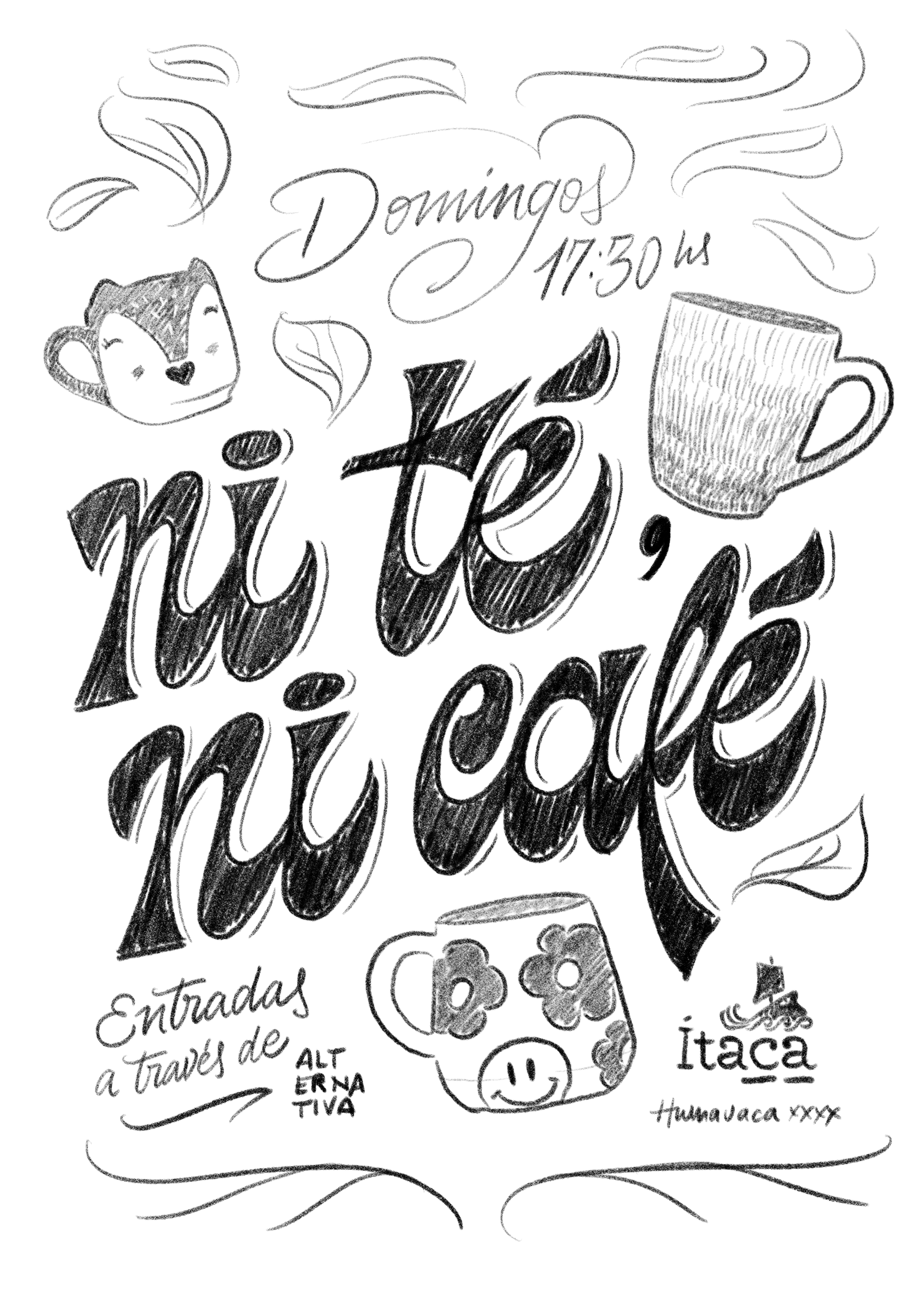
Segundo boceto / Second rough sketch
Boceto con ajustes / Sketch after feedback
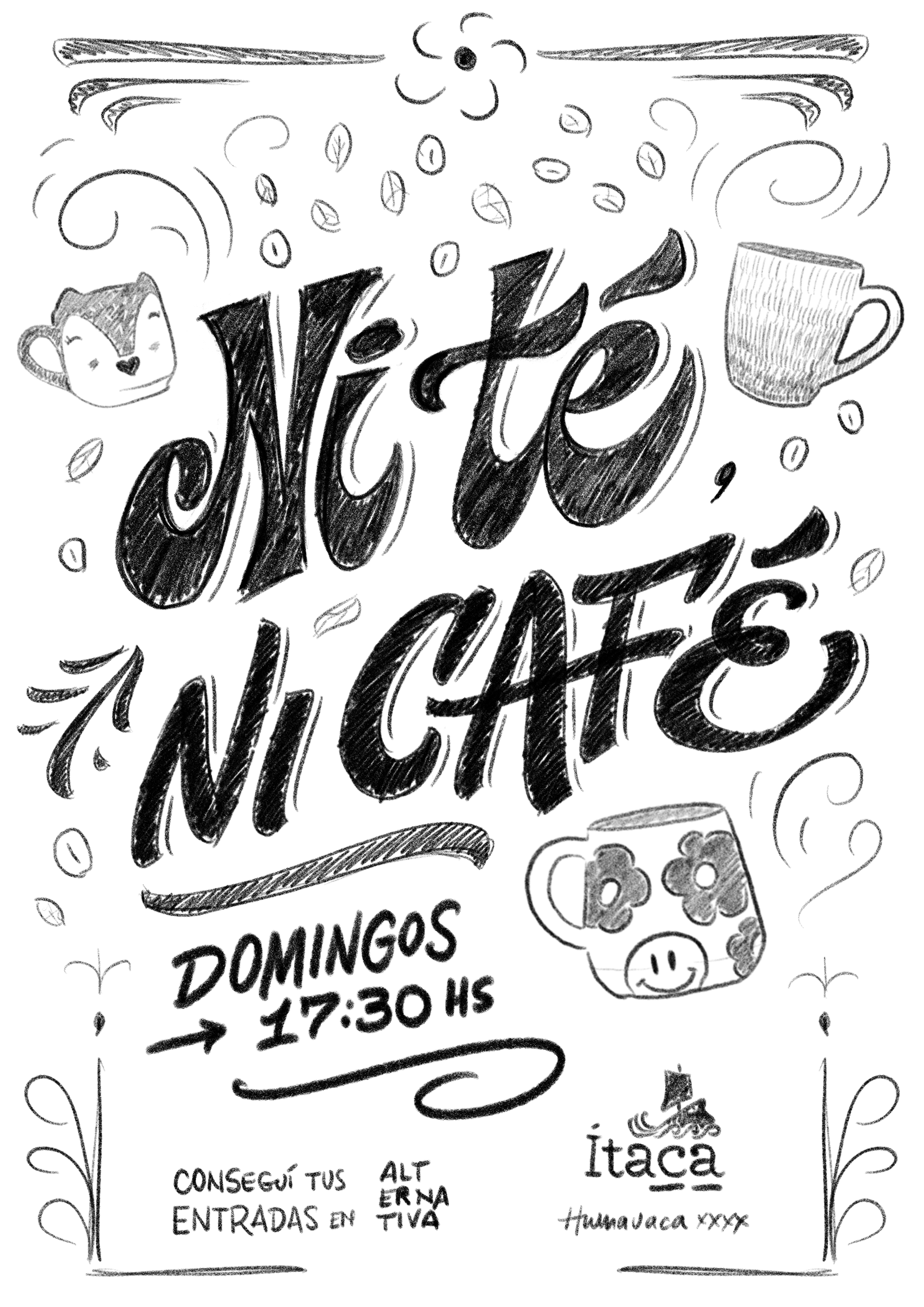
Boceto final / Final sketch

Proceso creativo / Creative process
ES
A partir de la lectura completa del texto y del trabajo en ensayos, surgió una decisión central: construir el afiche íntegramente desde el lettering y la ilustración. El título se convirtió en el eje principal de la composición, y desde allí se desarrolló el resto del sistema visual.
A partir de la lectura completa del texto y del trabajo en ensayos, surgió una decisión central: construir el afiche íntegramente desde el lettering y la ilustración. El título se convirtió en el eje principal de la composición, y desde allí se desarrolló el resto del sistema visual.
El proceso comenzó con bocetos a mano del lettering, entendiendo que la letra debía funcionar como la voz emocional de la obra. Luego aparecieron las ilustraciones de las tazas, objetos cotidianos presentes en escena que funcionan como metáfora de cada personaje. La composición se completó con texturas, ornamentos y detalles gráficos inspirados en lo doméstico y lo cotidiano.
EN
After a full reading of the script and working closely with rehearsals, a key decision emerged: to build the poster entirely through lettering and illustration. The title became the main axis of the composition, and the rest of the visual system was developed from there.
After a full reading of the script and working closely with rehearsals, a key decision emerged: to build the poster entirely through lettering and illustration. The title became the main axis of the composition, and the rest of the visual system was developed from there.
The process began with hand-drawn lettering sketches, understanding that the letterforms needed to act as the emotional voice of the play. The illustrated mugs then appeared as everyday objects present on stage, serving as metaphors for each character. Textures, ornaments, and graphic details inspired by domestic life completed the composition.
La solución visual / Visual solution
ES
La identidad visual se construyó a partir de un sistema ilustrado y tipográfico coherente. Las tres tazas representan el espíritu de las protagonistas: una abuela lúdica e irreverente, una madre más contenida y formal, y una hija joven atravesada por la ternura y la curiosidad.
La identidad visual se construyó a partir de un sistema ilustrado y tipográfico coherente. Las tres tazas representan el espíritu de las protagonistas: una abuela lúdica e irreverente, una madre más contenida y formal, y una hija joven atravesada por la ternura y la curiosidad.
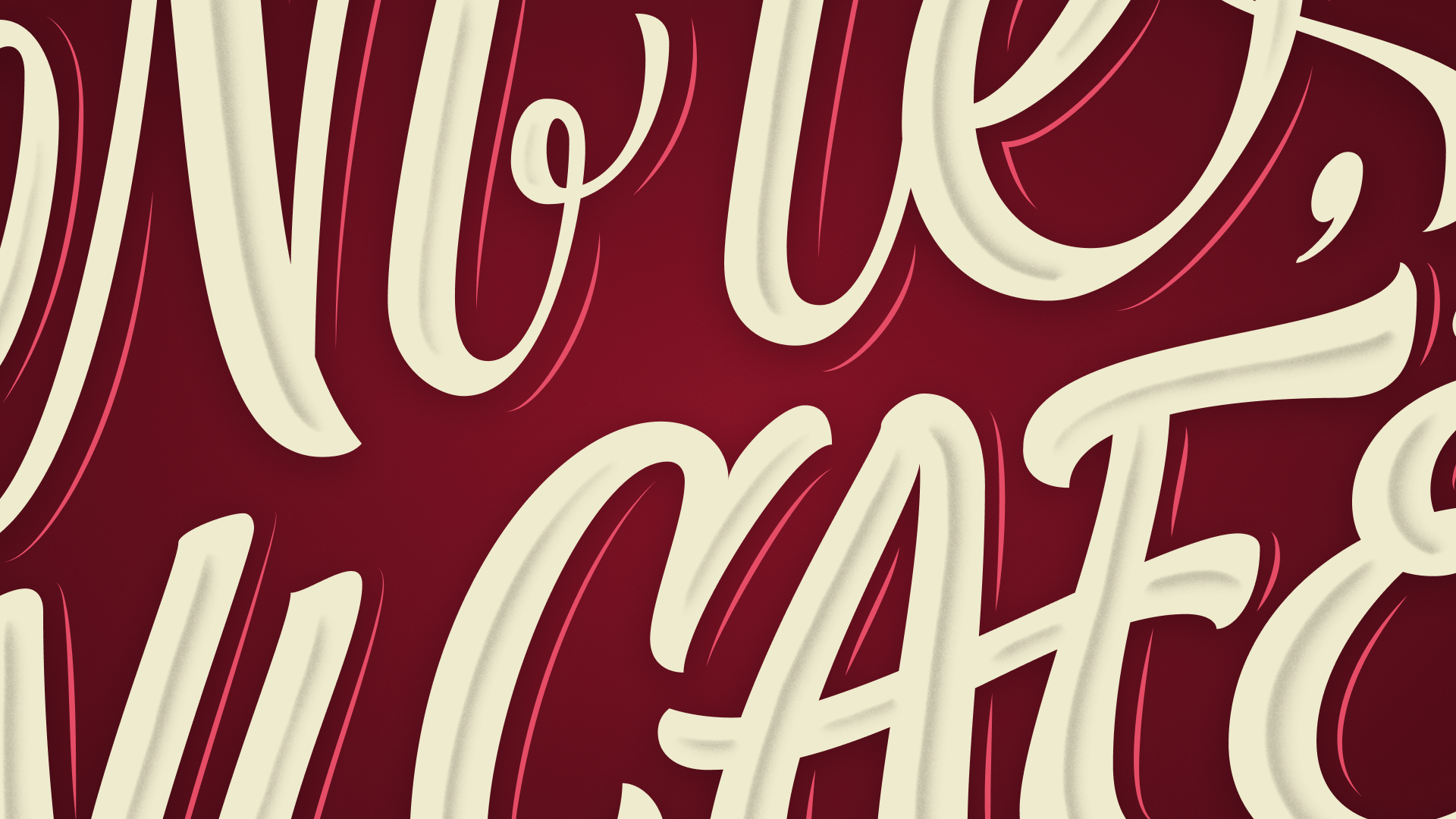
El lettering del título combina dos estilos distintos pero complementarios: un trazo más script para “Ni té” y uno más gestual y enérgico para “Ni café”. Esta diferencia remite simbólicamente a los universos que cada bebida representa dentro de la historia. La paleta de colores cálidos, las texturas suaves y los elementos ornamentales refuerzan la sensación de hogar y cercanía.
EN
The visual identity was built as a coherent illustrated and typographic system. The three mugs represent the spirit of the protagonists: a playful and irreverent grandmother, a more restrained and formal mother, and a young daughter driven by tenderness and curiosity.
The visual identity was built as a coherent illustrated and typographic system. The three mugs represent the spirit of the protagonists: a playful and irreverent grandmother, a more restrained and formal mother, and a young daughter driven by tenderness and curiosity.
The title lettering combines two distinct yet complementary styles: a more script-like stroke for “Ni té” and a more gestural, energetic approach for “Ni café”. This contrast symbolically reflects the different worlds each beverage represents within the story. Warm color palettes, soft textures, and ornamental details reinforce the feeling of home and closeness.
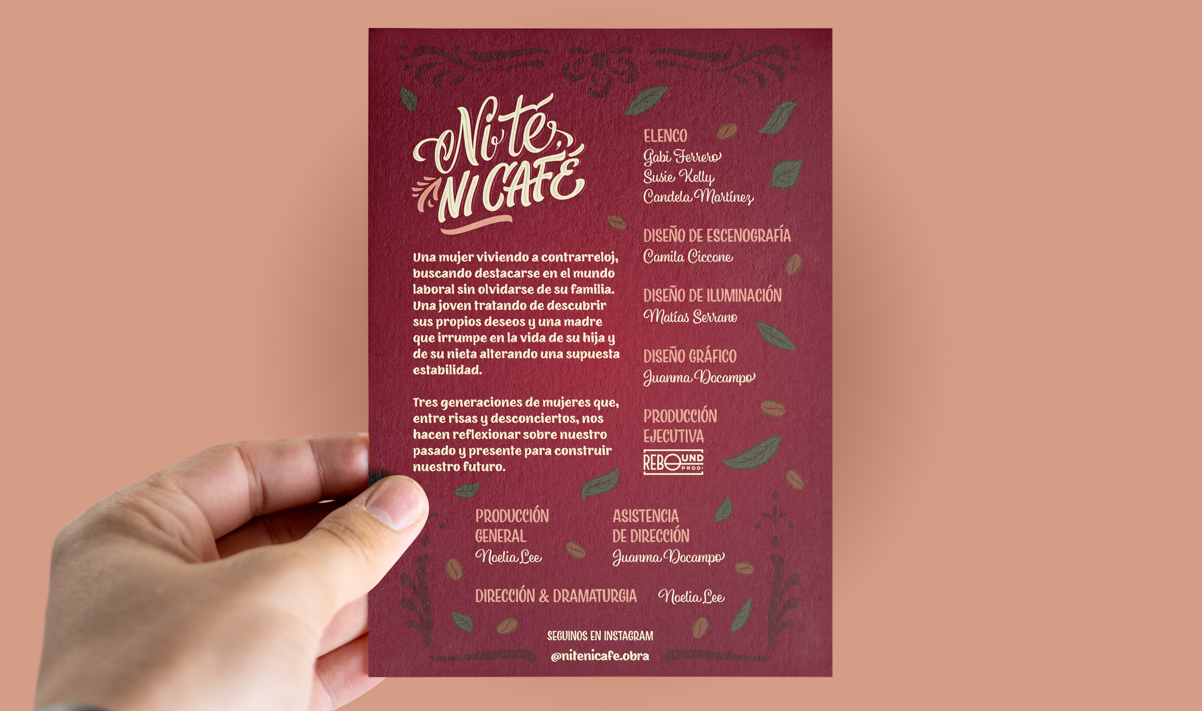
Dorso de programa de mano / Back of playbill
Resultado y aplicación / Outcome and application
ES
La identidad visual se aplicó en afiche, programa de mano, flyers digitales y piezas gráficas complementarias como stickers ilustrados. El diseño fue utilizado tal como fue concebido originalmente y acompañó a la obra durante toda su temporada en cartel.
La identidad visual se aplicó en afiche, programa de mano, flyers digitales y piezas gráficas complementarias como stickers ilustrados. El diseño fue utilizado tal como fue concebido originalmente y acompañó a la obra durante toda su temporada en cartel.
La propuesta recibió una respuesta muy positiva tanto por parte del equipo creativo como del público, que destacó la calidez visual y la conexión directa entre la gráfica y lo que sucedía en escena.
EN
The visual identity was applied across posters, hand programs, digital flyers, and complementary graphic pieces such as illustrated stickers. The design was used exactly as originally conceived and accompanied the play throughout its entire run.
The visual identity was applied across posters, hand programs, digital flyers, and complementary graphic pieces such as illustrated stickers. The design was used exactly as originally conceived and accompanied the play throughout its entire run.
The project received very positive feedback from both the creative team and the audience, who highlighted the warmth of the visuals and their strong connection to the on-stage experience.